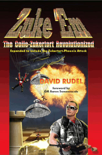
 An egregious example of how one must not compose a book cover
The evolution of my cover has been a rocky path. This is, after all, the first thing readers will see before diving head long into the thrilling story. All of it can be undone by a poorly drawn picture. In traditional publishing, writers have little to no say with this. This would leave me powerless to the whims of other people, a gamble I’m not willing to take.
Self-publishing gives me full responsibility over a cover’s look and feel. This means I own the final product, which allows me to transform my vision directly to the reader.
At first I thought it would be nice to do it myself. I have dabbled into art now and then, but I have no proficiency in it. The perfectionist in me would thus demand that I invest a lot of time, effort, and money to work up my skill so that it could bear some fruit. This would mean many years before a finished book even came out. Thankfully I scratched that idea and prayed for an artist willing to put up with my perfectionism. God answered it with another perfectionist!
 Danya (or Danyasaur, as she’s lovingly referred to on deviant art) is a rather recent friend of mine. We met at a Christian home group, talking about Jesus and good sci-fi over home-cooked, potluck dinners.
She is double majoring in Multimedia and Webmastering. Danya has a lot of great work on her Deviant Art account, but nothing in the realm of sci-fi. She was an untested artist, full of talent and an eagerness to learn. This is exactly what I was looking for.
I gave her a copy of the novella to see what she could come up with. She came back with the concept of the large city-sized ship in the story, called the Celestial City, flying in front of Mars. Oddly enough, this was the same concept I had as well. Needles to say, she was hired!
Thus began our collaborative adventures, lasting from November 2010 until July 2011.
~//~
The seed of an idea
 This is one of many basic concepts I sent to her, testament to my mad skills on Microsoft Paint.
I emailed this particular one to Danya about halfway through the process, giving her a rough estimate of the basic cover layout I was going for. It contained a ship, a planet, and a face. We would tackle it all one step at a time.
This is what she had to work with. Brilliance incarnate I know. It’s a good thing for all our sakes, she was blessed with a vivid imagination.
~//~
Mars and the Celestial City
In working on a futuristic Mars, the best place to start is with a picture of the original.
Danya used Photoshop to take a real picture of Mars, like the one above, and turn it into something rather amazing to behold.
This is her version of a terraformed Mars. Notice the clouds. Void Voyage 1 is set 500 years from now. By that time, scientist have changed the climate of Mars so that it has white clouds, water in liquid form, a strong magnetic field to protect the atmosphere from the sun, and breathable air.
The humble beginnings of Celestial City.
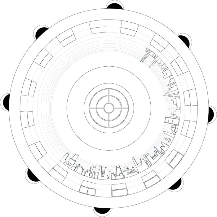
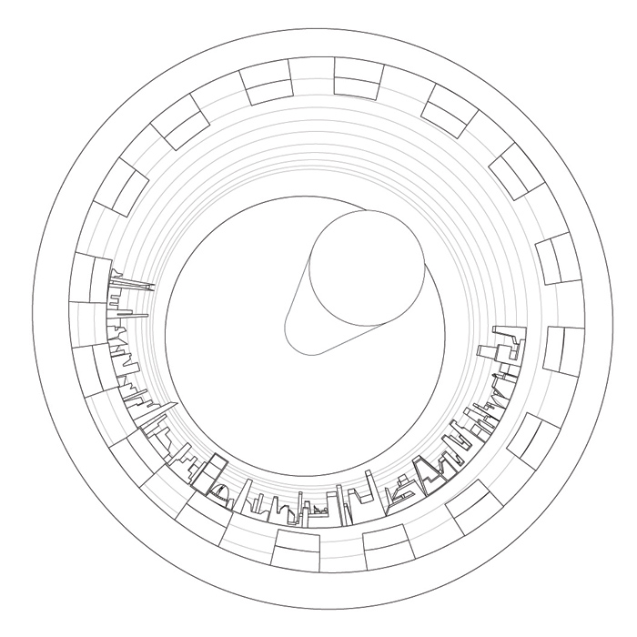
This was her first attempt at creating my vision of a two-kilometer-long flying city in space. She had the basics right: a long cylinder (as seen at its circular end) with skyscrapers built inside. She didn’t quite have the correct perspective though. So I sent her a Microsoft paint file showing the vanishing point.
She took this and sent me back a better version.
That eventually became something rather amazing to behold!
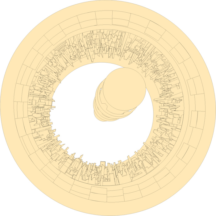
Danya’s basic work up of the wraparound city left me in awe. It took her more layers then I can count along with the detailed architecture of various skyscrapers, showing off a rather busy metropolis in space.
By the end of this first collaborative season, we had a basic idea of what the finished product would look like.
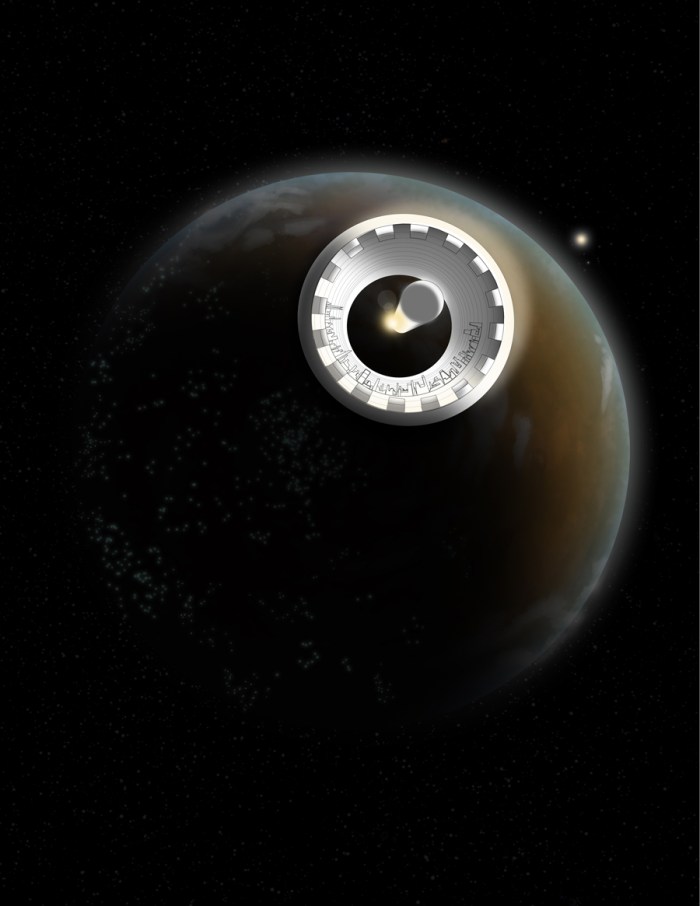 Minus the coloring of the ship of course
~//~
Dynamic lighting and shadow
Doing a great book cover means borrowing from what others have done before. I sent Danya two great science fiction films she could learn from: Bladerunner, for all of its detailed set pieces, and 2001: Space Odyssey, for how it depicted ships and planets in space.
She was quite a youngling in the ways of the nerd and hadn’t even seen them! Thus I felt it was my duty, as a master geek, to assign these two gems, for the sake of my book cover of course. The bonus side-effect was forever upping her nerd cred.
This picture of Blade Runner is a large set piece made completely by hand. There was no CGI used in the film. What you are seeing is a miniature. A man would look like Godzilla walking through the set, yet it takes on the shape of a dystopian metropolis extending for miles around.
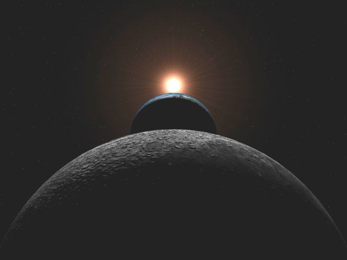
This is the opening scene in the ground breaking sci-fi epic. It gave her an idea of what I was looking for concerning how Mars and the city-sized ship would look with the sun shimmering behind.
Last but not least I sent her pictures of the real thing.
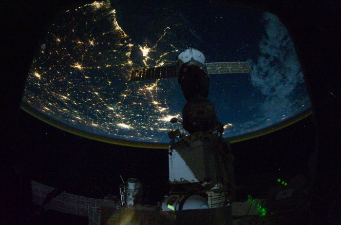 This was to show her how city lights look in space
 Notice the dynamic shadows seen on asteroids in space
 Here’s a wonderful pic of Jupiter and Io, one of its many moons
To this day not one sci-fi film (save 2001: Space Odyssey) has reached the beauty and awe I see in the photo above.
 This sun dial is a great example of how the sun can lengthen the shadow
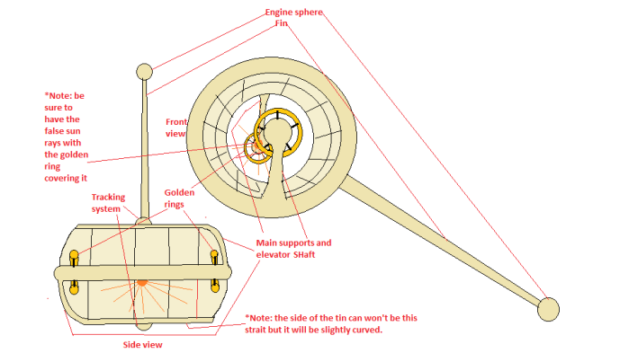
 The basic shape I wanted Celestial City to take, based on an airplane engine
I’m a stickler for realism. Even though my story is fiction, I’d like it to be believable. All of these photos grounded Danya’s vision of my cover until she too became well-versed in realism. By the end of our adventures, she was pointing things out to me that I had not noticed myself. It was a collaborative effort of give and take here. I was always open to her ideas. This kept my flaws in check and gave her ownership and passion over the final product.
Our vision of the cover was improving!
 Notice the two forms of light here, the sun on the right and the artificial sun near the middle of the ship.
The picture was half-way done! And it was looking quite good, for a random sci-fi poster. It was time to give the picture meaning.
~//~
An epic title for an epic story
Danya loosely based her title ideas on hand-drawn one’s that I had sent to her. I was all about lettering that looked cool… but couldn’t be read. She moved me towards clarity with a subtle artistic bend, simplifying what I had done.
Here are the various Void Voyages she came up with.
My first pick was a see-through title, edged around with some cool effects.
This title only lasted a few months before we changed it for something easier to read.
For a while we went with the doughnut-shaped Celestial City in front of the terraformed Mars. The critic in me was screaming for something else though… something to spice things up!
~//~
Adding fins to the ship
It was near Christmas when I came up with this novel idea (not the novella idea for my story now). I had just traveled 8 hours from Shreveport to San Antonio to spend the holiday with my family. This gave me plenty of time to think about that missing elements to my picture. The moment I had a chance, I created this lovely MS Paint file for Danya, describing the addition of a single fin to the Celestial City.
I liked the idea so much that followed it up with one that had more fins.
Needless to say she wasn’t too hot on the idea (Too many words I guess).
It took a haphazard photoshop painting from my cousin James to calm her fears.
A simple picture spoke louder than a detailed one with words. She was with me then and went to work out some of her own ideas.
 This is an early concept of the cover. Now the ship had fins and we had a pretty good looking title and layout.
The fins still needed some work but it was a start. I was pretty much fine with the tittle until a friend of ours found it hard to read. so…
~//~
Changing the title… again
As you have probably noted (though I didn’t at the time), the outlined retro look was difficult to discern in passing. The main point of the title is for it to be eye-catching and readable. Thus we decided, or rather Danya convinced me, that it should be a solid color. This gave way to another question… what color?
For a while we chose the first one in tan. Then I thought it would be neat, since the first episode takes place on Mars, to have it in red.
But this ended up looking pink! Both of us ignored this fact (though it would haunt our dreams for months until we changed it later). We just moved right along, leaving the fickle title alone for a time.
~//~
The Human Element
So far we had everything you would expect on a sci-fi cover, a planet and a ship. The only thing missing was a human face.
The main theme of my story is to present a thrilling epic adventure and the commoners that surround it. In every sci-fi epic I’ve seen, the common folk are used as the background noise in a wider story of galactic proportions; they aren’t given much of a story in their own right. Luke Skywalker may have started as a member of the common folk, but once his uncle and aunt died in Star Wars Episode IV, he never looked back.
I understand the reasoning behind this. Tales of a scrappy rebellion overcoming a galactic empire make for better fare then random workers at a spice factory on planet who-the-heck-cares.
The recent sci-fi series Battlestar Galactica broke through this barrier (the rule of camp as I call it). Sometimes whole episodes would be centered around the other people in the fleet, mere back ground noise brought to the fore. All of this added a sense of humanity and depth to the story. It helped us see how an everyday person might fit in that universe. Lost was another great show that did this.
Here’s my beef with ignoring it, my readers and I have normal, unexciting jobs. Mine is to write stories that allow others to escape those jobs for a while. The obvious part of this escapism is to help them live out their fantasies as Hon Solo, Luke Skywalker, or Princess Leia. There is a second part of immersion though, a nagging question begging to be answered. What would normal people be doing five-hundred years from now?
Thus I open Void Voyage 1 with a farmer, his twelve-year-old daughter, and a musician discussing the extraordinary events that surround them.
It is the daughter I focus on for the front cover. I didn’t know any professional models, though, so I went for the daughter of a friend (who also attended the Christian home group where I met Danya).
My friends Pat and Sandra are actual farmers in the real world, with three daughters and two sons. It was the oldest daughter, Taylor, I was after since she fit the age of the girl in my book.
So my story opens with a merchant farmer named Patrik and his oldest daughter named Talora (see what I did there).
Back in the real world now, Pat’s middle child, Sarah, is a piano student of mine. After a lesson at their house, Pat lent me his camera and I went on to take some pictures of Taylor. She was a good sport, giving me many different looks. The first batch of pics were in a room with too much light.
Then I remembered that Danya had asked me to take the picture in the dark, with no flash and a single light shinning on the side of her face. So Taylor, Pat, and I went in the closet. He held a lamp to her face and I started shooting away. Out of that, two pictures really struck pat and I as awe-inspiring.
 She had a playful look here, sort of like saying “This story’s going to be a fun ride.”
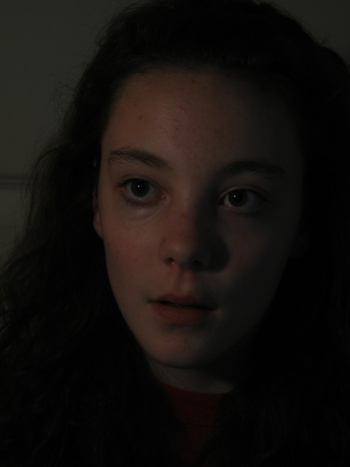 She looked mesmerized at something here, telling the reader to expect the unexpected
Pat and I liked the first pic. Sandra liked the second. I gave Danya the final say. After looking at ten of the pics, she agreed with Sandra. The women won out here.
My story isn’t a mischievous tale of fun and adventure. It’s a serious tale, set in a time with great technological advancements, and yet the people still fall back on their baser instincts of anger, jealousy, and war.
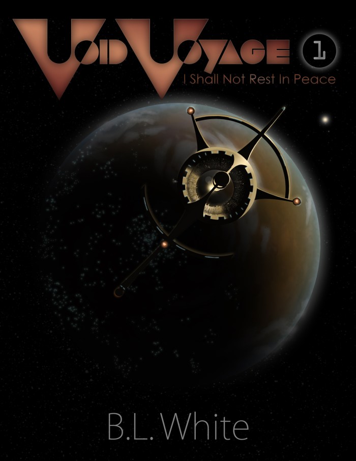
I did the easy part. Danya spent many hours converting the picture to something that would fit the art style of my cover. All that was needed was a space-plane going towards Mars, some changes to Celestial City’s fins (the subtle hint of a peace symbol), some deeper shadows, and there you have it!
 This was the near finished product shown first in my post To Compose an eBook.
Danya and I still had nightmares about that pink title though! We didn’t want to say anything because we feared the other might be married to the idea. Eventually it came out, so we both agreed to go back and change it… yet again!
~//~
Finishing the title
Danya added a third dimension to the letters (her idea) and changing the color to a sort of bluish silver (I just wanted blue she added the silver). Her thoughts were to make it look good with anything we put it in.
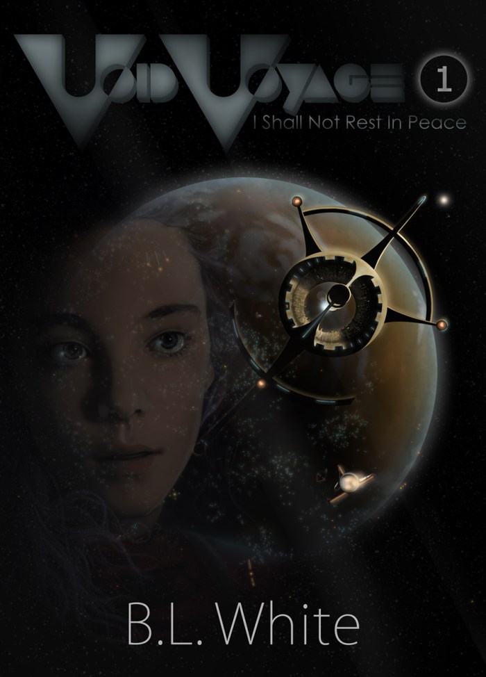
Now we have, at last, the final cover art for my book Void Voyage 1: I Shall not Rest in Peace.
It is a little taller to fit the eReader format. The title is also easier to read. Clarity and elegance come to mind when viewing it. The silver letters change the tone of the picture. Taylor looks a bit older and wiser now, which fits the tragic story I wish to convey.
~//~
One last thing
I’m no veteran when it comes to cover art design. And there are still many things Danya and I can learn. This isn’t a perfect picture. It could still use some of this and some of that…
…But!
The same can be said about my novella. It isn’t prefect and I can always add some stuff to it. I’ve just finished the story’s final read-through, cramming everything I can inside the focused tale about sacrifice and peace. I’ve read through my novella more than 30 times, growing a short story of 7,000 words to a novella of 33,333 words. You read it right… after I reached that word count I figured there was nothing more to say! One word more and the symmetry would be gone!
Wish me luck and prayers… and perhaps your future purchase?
Sad cat is sad until you click here.










Hey, I just got to read this. I really love how you wrote it. I felt like I was going on the journey with you. I appreciated seeing the developing work. Good job, Mr. White!
Thanks for the kind words!